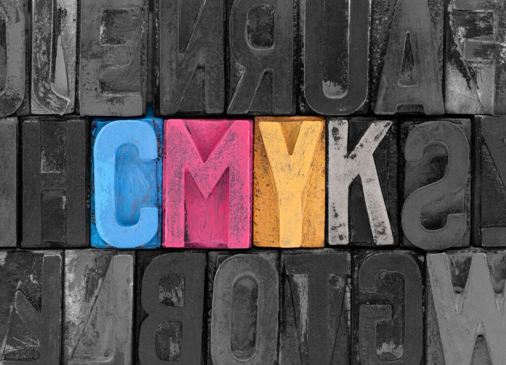
The CMYK color palette (Cyan, Magenta, Yellow, Black), used in offset printing at 90% in the orders, is suitable for reproducing color photographs and drawings, while special colors, Pantone, are used when you need to obtain a precise shade of a certain color, which you can reproduce identically in several places within the same work or several works; practically, the Pantone color will always appear the same, without the unwanted shade variations that the mixture of the four CMYK colors cannot avoid in many cases.
In CMYK, a certain shade is obtained by overlapping rasters with various percentage values, from the 4 basic colors, cyan, magenta, yellow and black. It is more difficult to control the values of 4 combined colors (CMYK) than a single color. As an additional advantage, the Pantone range is much richer in color than the CMYK range.
The graphic identity of a brand is generally regulated in a manual, which precisely specifies the color of each graphic element in the logo composition. The colors are first defined in the Pantone color register (which is usually used to print business cards, letterheads, envelopes and notebooks), then the equivalents are specified in the CMYK register. There are often visible chromatic differences, in some situations even difficult to accept, between the Pantone shades and their CMYK equivalent. This aspect is also highlighted by the samples that the Pantone company has edited.
Be careful when preparing files, which should not contain graphics or photos in the RGB color range! All printing uses CMYK or Pantone inks, not RGB. Only monitors use the RGB system to reproduce colors, and digital cameras and scanners use the RGB system to capture color images.
Pantone colors are also used when you want to print one or two fixed colors at once, as it is less expensive to use two Pantone colors instead of four (CMYK). In general, when you have to print brochures and multicolor catalogs, which contain both color image reproductions (photographs, graphics, drawings), as well as graphic elements of the company's identity (logos, repetitive markings, titles in the logo colors, etc.), it is a good idea to analyze the possibility of printing in CMYK + Pantone colors at slightly higher costs but with a stronger effect. Printing only in CMYK at lower costs, converting the logo colors, means taking on some risks, such as slightly duller colors in certain situations or small variations in hue.
However, practice shows that often the exclusive CMYK basic colors are used for several reasons. Before making these decisions, it is good to consult us, because the solutions are different, from case to case, depending on several factors that must be taken into account.
When you have to print black and white images in a demanding catalog, it is good to consider that these photos be reproduced in duotone or polychrome (CMYK), in order to gain depth and reproduce the richness of gray tones or to have the possibility of easily turning from a neutral gray to a sepia gray or to another desired shade. Obviously, the duotone version is more economical than the CMYK one, except in the case where, in addition to black and white images, you also have color images to reproduce. Duotone is a combination of two Pantone colors, one light and the other very dark, possibly even black. Each of the two colors and their mixture will add many tones to the classic black and white palette, especially in the light (1-10%) and dark (90-100%) areas, allowing for smoother transitions between close intensities.